INTRODUCTION
Poor usability of EHRs and its impact on clinicians
Electronic health records (EHRs) in the US are infamous for their cumbersome interface, insufficient workflow support, information overload, poor interoperability, and documentation burden on clinicians. Though EHRs have become an indispensable tool for doctors, these digital repositories of patient information are rift with user experience (UX) and user interface (UI) design flaws that impede efficient navigation and usage. Clinicians have pinpointed the lack of usability and interoperability as the main problems in several surveys over the past decade.
More than half of the primary care physicians (PCPs) surveyed by Stanford Medicine research via The American Medical Association and The Harris Poll said that EHRs need a complete overhaul, and 49% said using an EHR solution actually detracts from their clinical effectiveness. Other findings of the perception study include:
• Four in 10 PCPs (40%) believe there are more challenges with EHRs than benefits.
• 62% of time devoted to each patient is being spent in the EHR.
• Seven out of 10 physicians (71%) agree that EHRs greatly contribute to physician burnout.
• 44% of the respondents think EHRs are primarily meant for data storage.
• Three of four PCPs think improving EHRs’ UI could best address the challenges in the immediate future.
• Seven out of 10 PCPs (67%) think solving interoperability deficiencies should be the top priority for EHRs in the next decade.
• 43% want improved predictive analytics to support disease diagnosis, prevention, and population health management.
Unlike electronic medical records (EMRs), which contain a patient’s details in one particular health institution, an EHR is a record of a patient’s health journey across clinics, hospitals, labs, pharmacies, doctors, specialists, cities, and states. This blog will examine the UX/UI in EHRs to identify problems as they are destined to play a larger role in an individual’s health.
UX/UI FLAWS
EHRs do not provide an intuitive user interface
The consequences of subpar EHR designs extend beyond mere inconvenience and can affect patient engagement outcomes. While EHRs were ushered in with a focus on functionality as the healthcare industry transitioned from paper records to electronic formats, the nuances of intuitive and user-centric design can no longer be ignored.
Cluttered interfaces: EHRs are notorious for cluttered interfaces. Clinicians find it difficult to find the information they need when they need it. For example, clinicians must correlate certain data sets such as labs, medications, and vitals. If they are presented in close spatial proximity, it is easier to compare and integrate the information mentally; EHRs with cluttered interfaces force doctors to scroll up and down several pages, make notes on paper, and prescribe new medication. A pharmacist or nurse should ideally have the medication prescription displayed adjacent to the dispensation or administration screen, but such synchronization is rare. For the best healthcare UI design, grouping by topic is not enough — clinical decision-making should also be factored in.
Cumbersome data entry: Data entry in EHRs is known to eat into a physician’s precious time, which should be used for patient care. Physicians have been vocal about reducing screen time, delegating data entry to other staff, and using voice recording technology as a scribe during patient visits. The design of the data entry often clashes with the workflow process followed by a clinician, leading to medical errors. For example, a physician chose the wrong frequency for administering a drug, as the order in which the EHR had listed the options had been changed. It is important to confer with users and design healthcare UI to match established workflows to speed up data entry and retrieval to streamline healthcare operations and make healthcare delivery efficient and error-free.
Inconsistent terminology: The lack of standardization in the use of medical terminology in EHRs has led to needless confusion and the loss of precious time in treating medical emergencies. For example, when a diabetic patient arrives at the emergency with chest pain, the physician may see the term Type II DM in the primary care EHR documentation. The emergency room EHR, however, throws up the term ‘non-insulin-dependent diabetes mellitus (NIDDM). Though both terms refer to type 2 diabetes, the ER doctor may spend more time reconciling the two seemingly different diagnoses. This is time better spent on devoting to patient care, and the emergency doctor may even neglect to consider crucial information that impacts treatment decisions.
Poor visualization techniques: Using vague icons or far-fetched abstract shapes to represent objects, processes, or operations in healthcare has led to misinterpretation and even rejection of EHR solutions. Symbols should be as literal, functional, or operational as possible to avoid confusion among clinicians. It is better to stick to clear language where ubiquitous symbols or representational icons are not available. Consistency in use is also important — an EHR may use a red exclamation mark to show that a lab result is out of range. This is critical information and can alert both doctors and nurses. However, if the EHR uses the same symbol for non-critical information, such as missing information on a form, clinical alertness may turn lax.
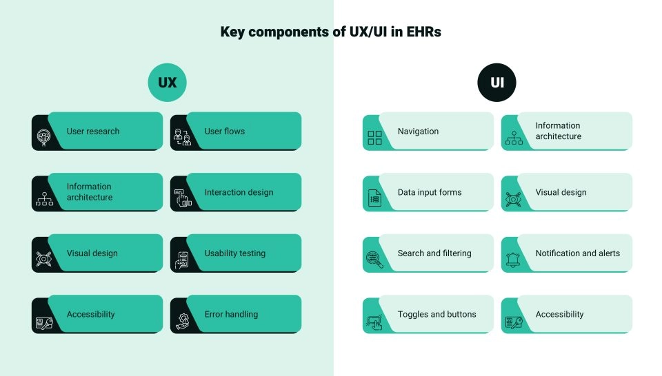
Other factors that affect the UX/UI in EHRs include lengthy documentation procedures, insufficient workflow support, incompatibility between EHR systems, information overload, and insufficient training and support. User dissatisfaction is usually traced to a lack of customization options. Customizable UX/UI in EHRs can accommodate the diverse needs and preferences of different healthcare providers.
We employ top-notch design principles to create electronic health records with enhanced UI/UX designs.

UX/UI in EHRs should incorporate intuitive UI and streamlined workflows for best UX
EVOLUTION
Healthcare institutions are trying to address EHR shortcomings
Most healthcare providers are responding to the outcry against flawed EHR solutions as the quest for the perfect EHR gains ground. While big-ticket investments in EHR implementations were in the news all these years, US health providers are now launching EHR optimization, EHR innovation, EHR customization, EHR best practices, EHR integration, EHR interoperability, and EHR modernization projects that invariably aim to address usability, comfort, adoption, and navigation issues. For instance:
• Intermountain Healthcare, based in Salt Lake City, has committed to migrating to Epic as part of its overarching strategy to implement a single EHR system across its extensive network of 33 hospitals and 385 clinics spanning seven states by the end of 2025.
The stated objective is to prioritize the satisfaction of caregivers and patients while streamlining workflows.
• Eastern Nephrology Associates, a nephrology practice in eastern North Carolina and northeastern South Carolina that comprises kidney specialists who deliver nephrology, kidney dialysis, kidney transplant, and hypertension care in 14 offices, more than 40 dialysis centers and two vascular access centers, has introduced a new value-based care EHR system.
It has increased the optimal startrate —when a patient begins dialysis at home, receives a preemptive transplant, or begins in-center hemodialysis — to 90%.
• The National Institutes of Health’s (NIH) Clinical Center in Bethesda, Maryland, plans to replace its 20-year-old Clinical Research Information System (CRIS) with a new AI-enabled decision-support EHR. The NIH says -
EHR is no longer an IT project but an organizational AI project with the ability to visualize, summarize, and do natural language processing, taking it beyond where it has been.
INNOVATION
Embracing new technologies to co-create physician-friendly EHR solutions
As the next-generation EHR solutions gather pace, leading EHR solutions and service providers, including Epic Systems, Oracle Cerner, MEDITECH, Athenahealth, Elation Health, Canvas Medical, and eClinicalWorks are focusing on innovations that promote clinical decision-making and patient care. Let us take a quick look at the latest technology trends shaping UX/UI in EHRs:
• Use of AI, machine learning, and optical character recognition to enable the automatic selection of insurance packages after scanning a patient’s photo or insurance card.
• Voice commands to allow physicians to dictate prescriptions.
• Speech recognition and ambient AI technology for note-taking during physician-patient interactions.
• Generative AI for draft clinical notes to be reviewed by physician.
• AI-enhanced empathetic note draft responses to patient messages.
• AI-agent-based frameworks to assist in workflow processes.
• AI-backed ‘context-aware’ next-step recommendations and smart phrase shortcuts to reduce clinician burden and aid clinical decision-making — scheduling labs, next appointments, and ordering medications.
• Predictive analysis for diagnosis and personalized treatment plans.
• AI-based prediction model for no-shows.
• AI and robotic process automation through automated playlists.
• Image AI for facial recognition-based streamlining of check-ins and patient-provider match of inbound communications.
• Access to the Epic app on the Mac App Store.
We prioritize UI/UX enhancements to elevate the EHR experience to new heights.
CONCLUSION
Refinements to EHRs will remain a continual endeavor
That EHRs can never remain static is now industry knowledge. With a goal to improve patient care and clinicians demanding more intuitive interfaces and intelligent functionalities, EHR solutions will forever strive for perfection with continuous innovations.
In addition, compliance rules make interoperability a key requirement: the Office of the National Coordinator for Health Information Technology (ONC) issued the Health Data, Technology, and Interoperability: Certification Program Updates, Algorithm Transparency, and Information Sharing Final Rule (HTI-1 Final Rule), which implements provisions of the 21st Century Cures Act; it accelerates health information exchange through the Trusted Exchange Framework and Common Agreement under which Qualified Health Information Networks (QHINs) are able to securely exchange information according to common, nationwide, technical and policy standards.
As part of a QHIN, EHRs can access high-quality data and identify care gaps to help patients make better treatment decisions.
Thus, by addressing flaws in EHR usability, leveraging emerging technologies, prioritizing user-centered design, and ensuring compliance, EHRs can become more efficient and less of a burden for clinicians.


